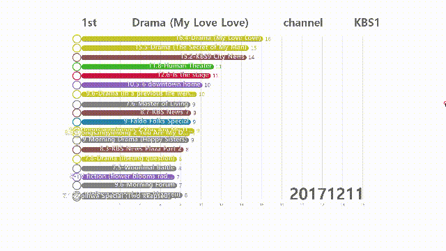
바 차트레이싱 한국 시청률 랭킹 2011-2020
Race with Matplotlib
If we have data (big data), we can use it to visualize data.
If you have a variety of formats, Python is a powerful weapon for data preprocessing.
Let’s Code
Matplotlib’s style defaults are designed for many common situations.
I`m crawling data from Website about "Korea TV viewing rate" in 2011-2020(Every Monday)
Also, I`m missing data type(group) when it is mess in color.
from bs4 import BeautifulSoup<br>
import requests<br>
import csv<br>
from datetime import datetime<br>
import pandas<br>
import pandas as pd<br>
import itertools
Read the Data set(csv file) with pandas. We only need 4 columns to work with 'name', 'group', 'year', 'value'.
url = 'output1.csv'
df = pd.read_csv(url,usecols=['name', 'group', 'year', 'value'],encoding='CP949')
df.head(3)

Color, Labels
Next, let’s add values, group labels and colors based on groups. We’ll user colors and group_lk to add color to the bars.
# colors
def transform_color(color, amount = 0.5):
    try:
        c = mc.cnames[color]
    except:
        c = color
        c = colorsys.rgb_to_hls(*mc.to_rgb(c))
    return colorsys.hls_to_rgb(c[0], 1 - amount * (1 - c[1]), c[2])

all_names = df['name'].unique().tolist()
random_hex_colors = []
group_lk = df.set_index('name')['group'].to_dict()
group_lk is mapping between name and group values.
for i in range(len(all_names)):
    random_hex_colors.append('#' + '%06X' % randint(0, 0xFFFFFF))
rgb_colors = [transform_color(i, 1) for i in random_hex_colors]
rgb_colors_opacity = [rgb_colors[x] + (0.825,) for x in range(len(rgb_colors))]
rgb_colors_dark = [transform_color(i, 1.12) for i in random_hex_colors]
Basic chart
Now, let’s plot a basic bar chart. We start by creating a figure and an axes. Then, we use ax.barh(x, y) to draw horizontal barchart.
fig, ax = plt.subplots(figsize = (36, 20))
num_of_elements = 10
Polish Style
We need to style following items:
- Text: Update font sizes, color, orientation
- Axis: Move X-axis to top, add color & subtitle
- Grid: Add lines behind bars
- Format: comma separated values and axes tickers
- Add title, credits, gutter space
- Remove: box frame, y-axis labels
def draw_barchart(current_year):
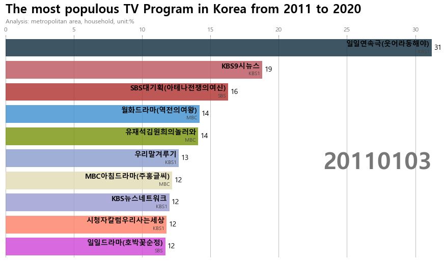
dff = df[df['year'].eq(current_year)].sort_values(by='value', ascending=True).tail(10)
ax.clear()
normal_colors = dict(zip(df['name'].unique(), rgb_colors_opacity))
ax.barh(dff['name'], dff['value'], color = [normal_colors[x] for x in dff['name']])
dx = dff['value'].max() / 200
for i, (value, name) in enumerate(zip(dff['value'], dff['name'])):
ax.text(value-dx, i,name,size=14, weight=600, ha='right', va='bottom')
ax.text(value-dx, i-.25, group_lk[name], size=10, color='#444444', ha='right', va='baseline')
ax.text(value+dx, i, f'{value:,.0f}', size=14, ha='left', va='center')
ax.text(1, 0.4, current_year, transform=ax.transAxes, color='#777777', size=46, ha='right', weight=800)
ax.text(0, 1.06, 'Analysis: metropolitan area, household, unit:%', transform=ax.transAxes, size=12, color='#777777')
ax.xaxis.set_major_formatter(ticker.StrMethodFormatter('{x:,.0f}'))
ax.xaxis.set_ticks_position('top')
ax.tick_params(axis='x', colors='#777777', labelsize=12)
ax.set_yticks([])
ax.margins(0, 0.01)
ax.grid(which='major', axis='x', linestyle='-')
ax.set_axisbelow(True)
ax.text(0, 1.15, 'The most populous TV Program in Korea from 2011 to 2020',
transform=ax.transAxes, size=24, weight=600, ha='left', va='top')
plt.box(False)
draw_barchart()Animate Race
To animate the race, we will use FuncAnimation from matplotlib.animation. We also use frames, this argument accepts on what values you want to run draw_barchart – we’ll run from year 2011 to 2020
font_name = font_manager.FontProperties(fname="c:/Windows/Fonts/malgun.ttf").get_name() rc('font', family=font_name) fig, ax = plt.subplots(figsize=(15, 8)) animator = animation.FuncAnimation(fig, draw_barchart, frames=frames_list) HTML(animator.to_jshtml()) # HTML(animator.to_html5_video( )) # animator.save( 'test.mp4') plt.show()
You could save the animator object to a video/gif or play within the notebook.
Bonus_1: UTF-8 Encoding
2 ways encoding font
- install matasploit font
- Using Font_manager
font_name = font_manager.FontProperties(fname="c:/Windows/Fonts/malgun.ttf").get_name()
rc('font', family=font_name)Gighub
https://github.com/figureking/Bigdata/blob/master/Bar%20Chart%20Race%20in%20kr%20program.ipynb
'Data Science ' 카테고리의 다른 글
| 데이터 사이언스 남은 과제들 (0) | 2020.05.27 |
|---|---|
| 심슨의 역설 Simpson's paradox (0) | 2020.05.27 |
| [차트랭킹]역대 공중파 티비 시청률 순위 2011 - 2020 (0) | 2020.02.17 |
| [BigData]Earthsquake on Map. 지진 빅데이터 지도에 표시하기 (0) | 2020.01.16 |
| 왜 통계치 p값의 오용을 주의해야 하는가? (0) | 2019.12.14 |